 I now have three slightly different versions of the same card. The layers of the original version, shown first, were intended to compete with each other for attention. This is the opposite of what we talked about in class, creating readable pieces with complimentary elements, but when thinking about what a business card means in direct application to my life, the overwhelming thought I had was that I am not a business person--but I do eat like it's my job. So, I decided to create a sort of collage with my favorite foods, then narrowed it down to my favorite vegetables. New to photoshop, this arrangement was quite a feat for me.
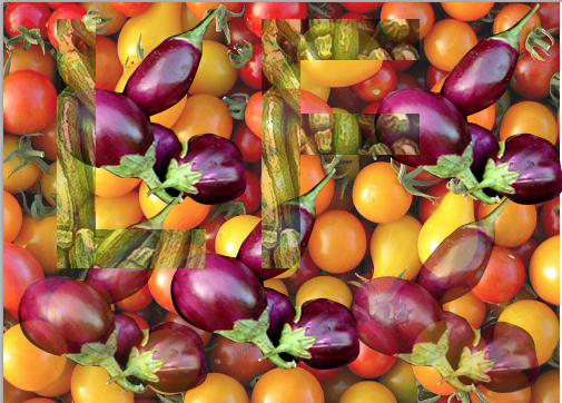
But I wanted to continue to play with the idea of competing elements and created two other versions that differ not so much in composition but in opacity and clarity. The first attempts to blend the images into each other even more than the original. By making the foreground more opaque, I hoped to bring the levels into more of an even plane.

No comments:
Post a Comment